
The Logic Behind My Prototype for Totem
In fact, there are three reasons behind my prototype for timing bar:
- User’s eyes don’t focus on a media player in the same way they focus on a word processor for example.
- Word processors have a side-focus-angle which is the start reading/writing point, which is actually in the top-left side of the application window (or top-right in middle-eastern languages).
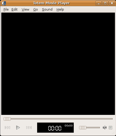
- While in media players, there is no language-context. Instead, there is a black board hides a lot of events and surprises waiting to appear once in the middle of it, so it has a central-focus-point, and the whole application should have this spirit; the spirit of centralization, that’s why the timing information shouldn’t be considered as a status in a regular status bar in a regular language-context-based application, it should appear in a central black board screen, just like the original video central black board.
- In the original design, there is a wide unused space under the seek bar, and timing information appears in a small silly corner in the application window.
The solution is to take advantage of this wasted space, and putting the timing information in a respected board in this area, with size it deserves. - By this suggested design we can make timing board richer, and more interactive.
- Rich: arranging timing information in distributed areas instead of putting it in a one single line makes it more readable.
- Interactive: for example, double clicking on the time numbers to offer the time left with (-) sign, just like XMMP/Winamp.